
Think about this for a moment. You can find a great deal of reasons to make side projects – such as learning, having fun or creating something that will be used and appreciated by others. It requires an ample amount of creativity and hard work.
Even though some may disagree, I think that there is way more pros than cons to this. In this series, we are going to write a little bit of code together and see what can be accomplished.
Our first project is called React Digital Display. As the name suggests, it is a React component, which displays text. Although it looks quite simple, we will add one lovely feature: it will be able to take different components as display modules and use them under the hood. For example, it can be a 7-segment module, or a dot matrix, or anything you can imagine. It does not even have to look like LED.
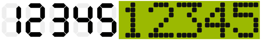
Our component in two versions: 7-segment module and 5x7 dot matrix.
Warming Up Before the Main Course
Firstly, let's prepare the necessary list of requirements. Obviously, I have many more ideas in store, but we will start with the basic ones. As far as I can see it, the user should be able to:
- Define the text to display.
- Choose the display module type.
- Set the display size (how many modules are in a row).
- Set the display height.
- Choose how to proceed if the module does not support certain characters:
- display an empty space,
- omit a character and display the next one.
Now we can write the first interface that describes the props of the component. It will look like the following:
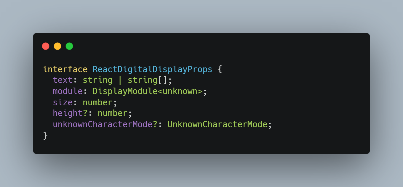
If you are looking at this, you probably have some questions. Let me explain.
Why are we using string | string[] for text, if there is only one row?
The answer is simple. Module will display "character", but it doesn't need to be defined by single ASCII character. For example, we will use the special EMPTY character to indicate that there is nothing to display. This is useful for unknownCharacterMode.
What is UnknownCharacterMode?
It is a simple union of two strings, which are our methods for handling unsupported characters.
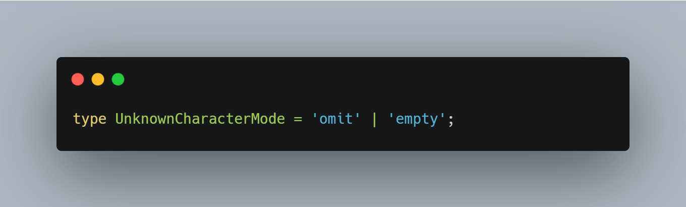
It could be an enum, but in this case it is not necessary.
What is DisplayModule?
The answer to this question is a little more complicated. I will cover it in the next section.
How to define a module
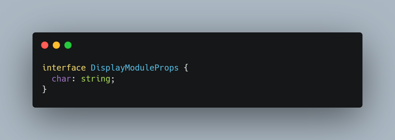
The display module is a component whose only job is to display the character. We can write a simple interface for it, and any module created by us or anyone else should implement that interface.
Each module needs a list of supported characters and information about how to display them. We will call this a charset, and that's also the name of our interface that describes it. Let us take a quick look at it:
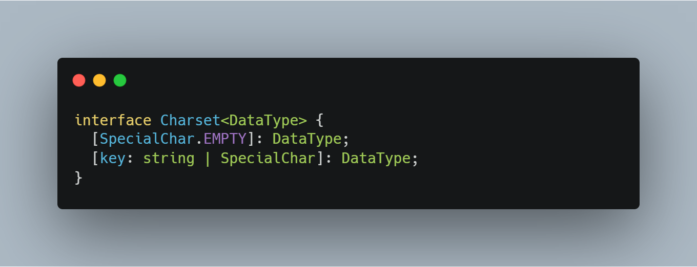
Different modules have different needs, that’s why we need to use a generic here. For example, the 7-segment module will use an array of 7 booleans as its DataType, while the dot matrix will require a 2-dimensional array. The only character required is EMPTY, which describes how the empty state of the display module should be represented. I also added the possibility to define other special characters, but this is the only one at the moment.
What exactly is DisplayModule?
Our main component will have two responsibilities:
- Taking care of unsupported characters.
- Scaling of the module for a given height.
In order to do this, it needs to know what characters are supported and what the dimensions of the module are. And this information must be provided by the module itself. Here you can see how it is done:
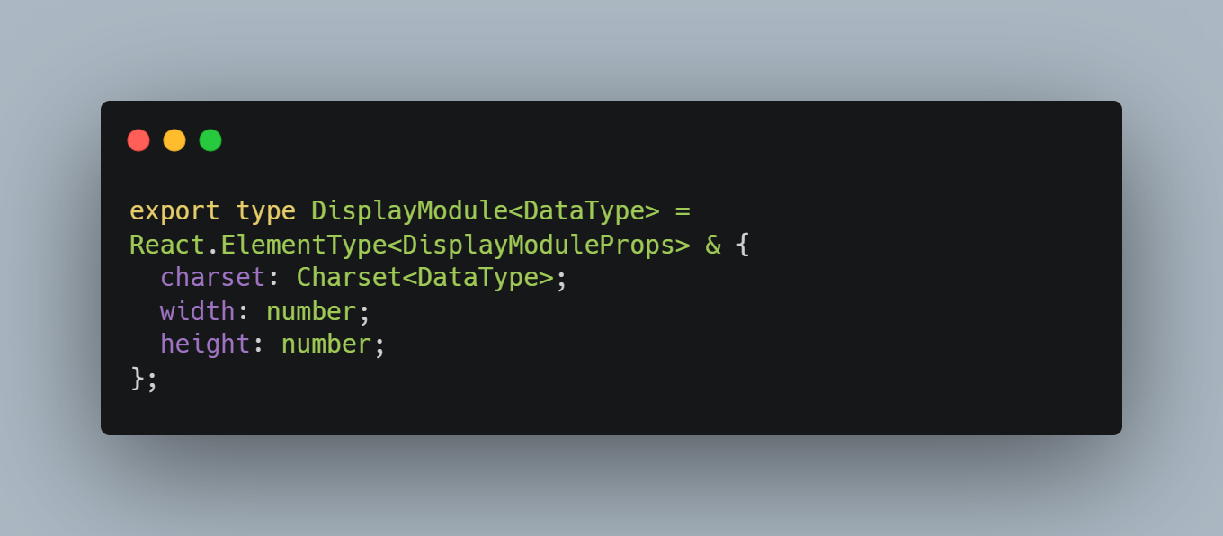
Basically, it's a React.ElementType (it allows the use of function and class components) with additional static properties for metadata, required by the ReactDigitalDisplay component.
Now we can move on to the more interesting part – writing the actual components.
First module
Before we write the main component, let us create our first module. We will start with the 7-segment display. As the name suggests, it consists of seven segments. In real life, these displays also have a dot, but we will leave that out for now. The segments are named from a to g, as shown below:
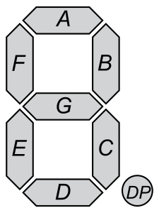
(picture from https://en.wikipedia.org/wiki/Seven-segment_display)
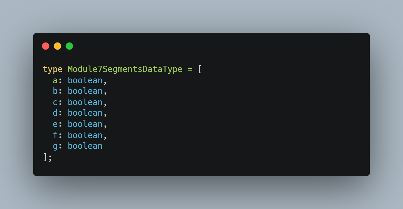
To begin, we will define the DataType of the module. As I said before, it will be an array of 7 boolean values and we can use tuple for it. Tuple is a fixed length array where you can define the type for each element. They could be different, but that is not the case. We can also add labels for each element to help us understand the meaning of these booleans. You can read more about tuples here.
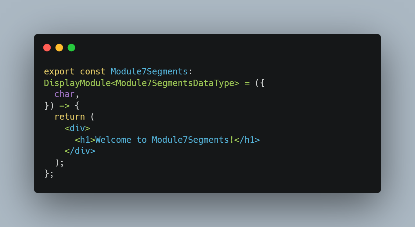
Once we have the data type, now we can start creating a module. It will be a DisplayModule with basic markup.
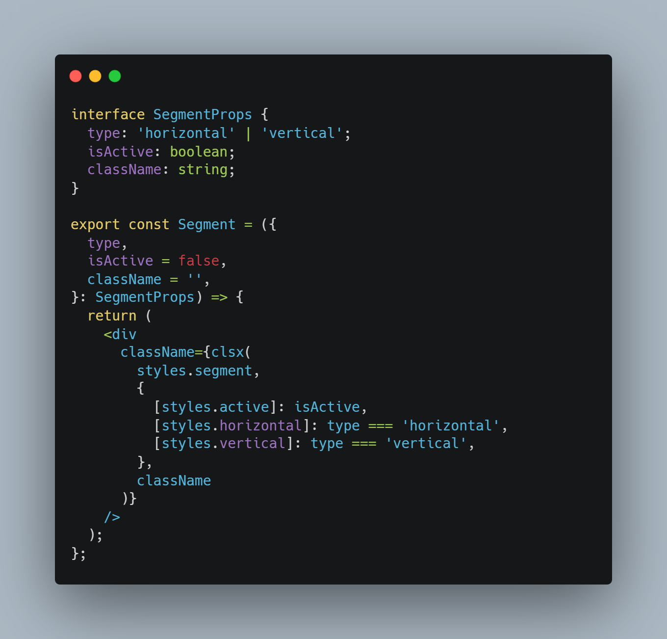
Before we implement the whole module, we have to create a single segment component. It can be either horizontal or vertical - and we also need its active state. The last property will be className for positioning.
I will not go into the details of full implementation at the moment. In short, the segment is a single div element. We use its :before and :after pseudo-elements to create two halves. After we apply colour to one of the borders and transparency to two others, each half will look like a trapezoid. We just need to position it correctly to make it look like a proper segment.
You can find the full code at this link.
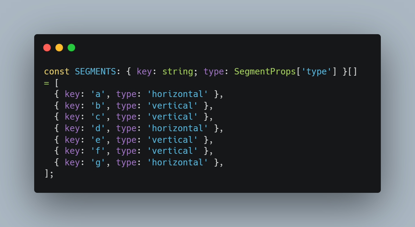
We have segments and we have an empty module component. Let us put this together. We start with a list of segments with key (the same as for the tuple label) and orientation.
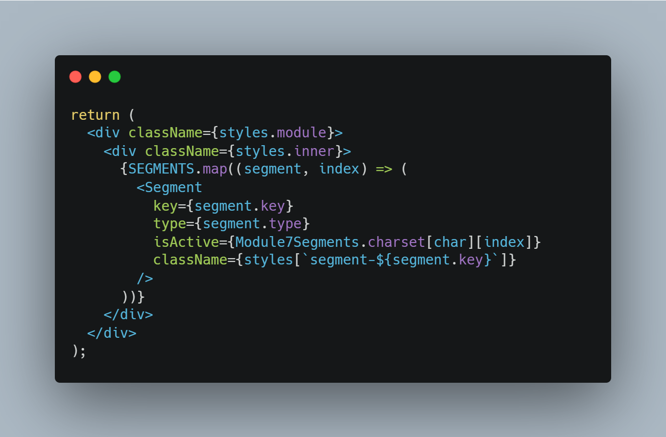
After defining our segments, we can render them and add positioning via CSS. Now our component looks like this:
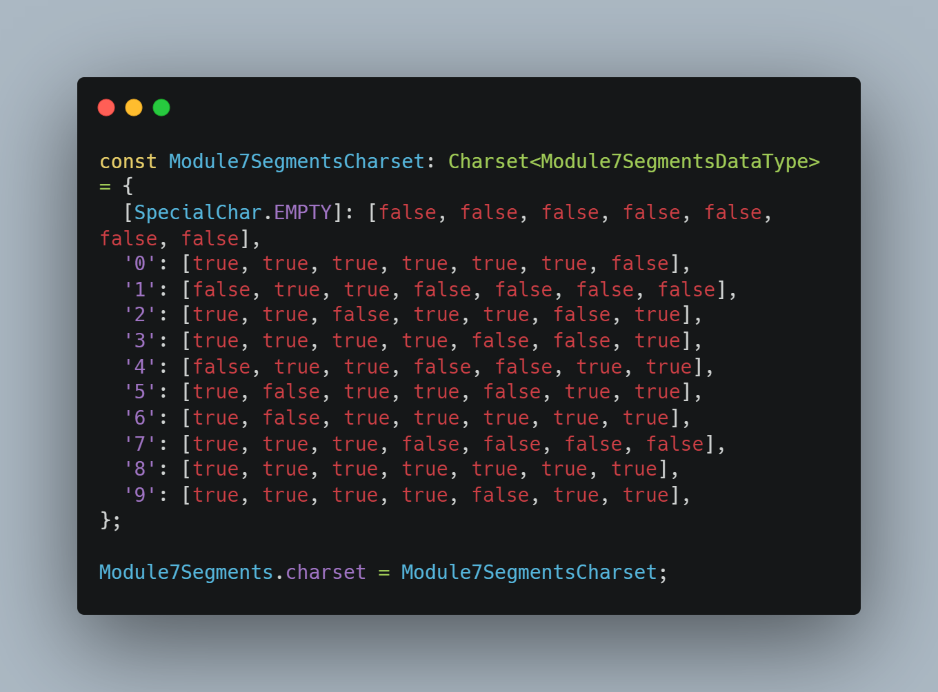
Last but not least, we need to define the character set for our display module. Currently it is only the digits 0-9, but in the future it can be extended to other characters. At the end, we need to append the charset to our module so that it is available to the ReactDigitalDisplay component.
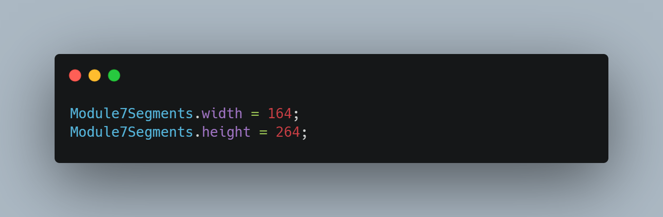
Once the styling is complete, we can calculate the final dimensions of the module in pixels and assign them to the module as a static property.
Below you can see what our module looks like.
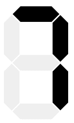
Final view of 7-segment module.
All in a nutshell
That's all for today. We have planned our work and created the first module for our component. The full code is available in this repository. Next time we will implement the main component and use the newly created module to display text.
See you next time!