
In the first part of this series, we addressed the requirements and delved a bit into theory. After that, we looked at implementing the 7-segment display module component. Hold on tight this time, because we are going to use it and display some text.
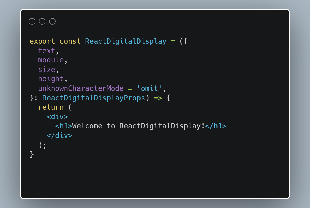
First, we need to create a ReactDigitalDisplay component. It will use the props interface that we declared earlier.
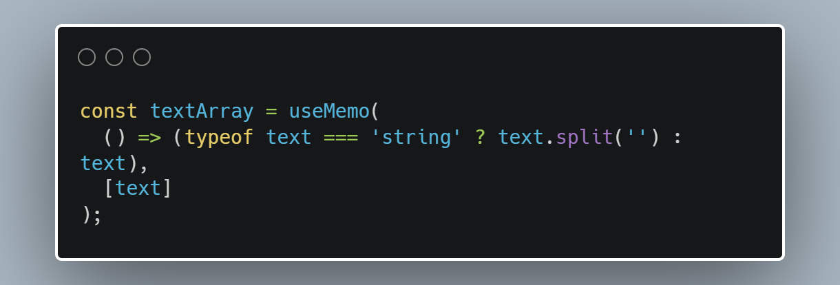
As you may recall, our text is entered as string | string[]. Let's normalize it. We'll use array, which will enable us to easily map the characters.
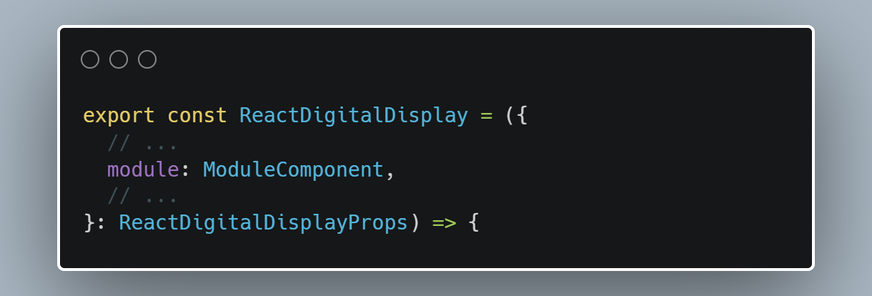
Now we are going to render characters. Since JSX requires the component names to be capitalized, we will make a small change in the component definition.
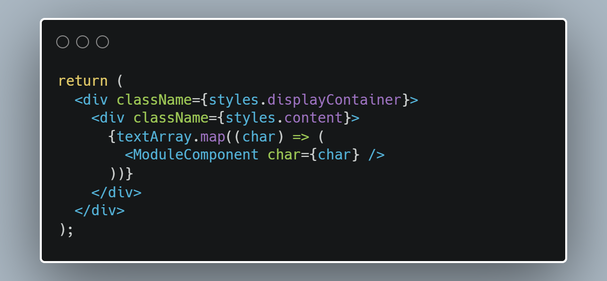
We have a component, and text, so we are able to render it. Our ReactDigitalDisplay will have the following return statement:
Let's use it. For the first test, we're going to display a simple number - "1994".
 |
|---|
| Component displaying "1994" |
This is pretty impressive, but it has a problem. If we try to use characters that are not supported by the module, the entire component crashes. We need to fix that.
Unsupported character handling
To do this, we're going to use the module's charset property to check for unsupported characters and filter them out.
First, we iterate through the text and check each character. If it’s not included in the charset, we replace it with null or EMPTY, based on unknownCharacterMode. At the end, we are filtering out the nulls from our array and filling the array with EMPTY characters, so that its length is equal to size.
I will now show you how it works. This time, I am going to use "S01E07" as the input. I also set the component size to 6.
 |
|---|
Rendered text, with unknownCharacterMode set to empty on left and omit on right |
Component size
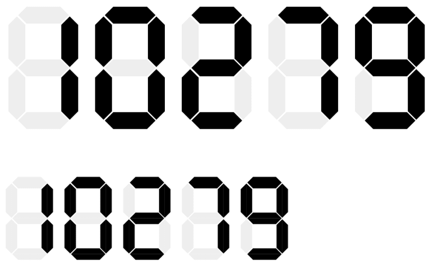
Next, we will scale our text to the specified height. For this we will use the dimensions of the display module.
Basically, we determine the dimensions for container with n modules (where n is our size prop), and then calculate the scale factor for the custom height. Next, we use the CSS transform property to apply the proper scale. Finally, we need to set the width and height of the container.
This is the result:
 |
|---|
| Component original size (top) and scaled (bottom) |
We have completed our main component. We will create another display module to show the customizability of display.
Second module
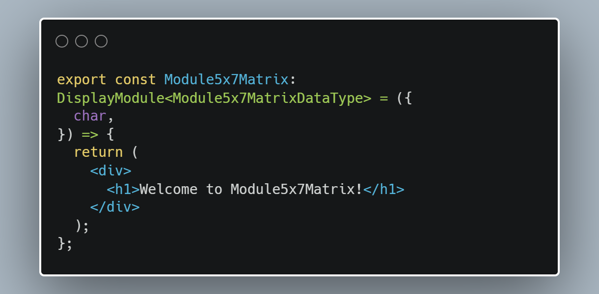
To better highlight our best feature, which is the ability to use different components, we will create a dot matrix module. Please note that it supports some letters in addition to digits.
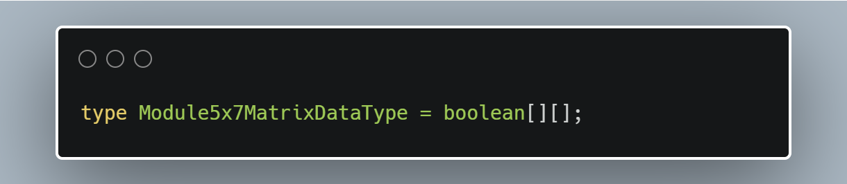
To begin, we are going to define the DataType of the module. It will be a 2-dimensional array of booleans.
We can now start implementing the module, the process of which is similar to the first one. Let's start with an empty component:
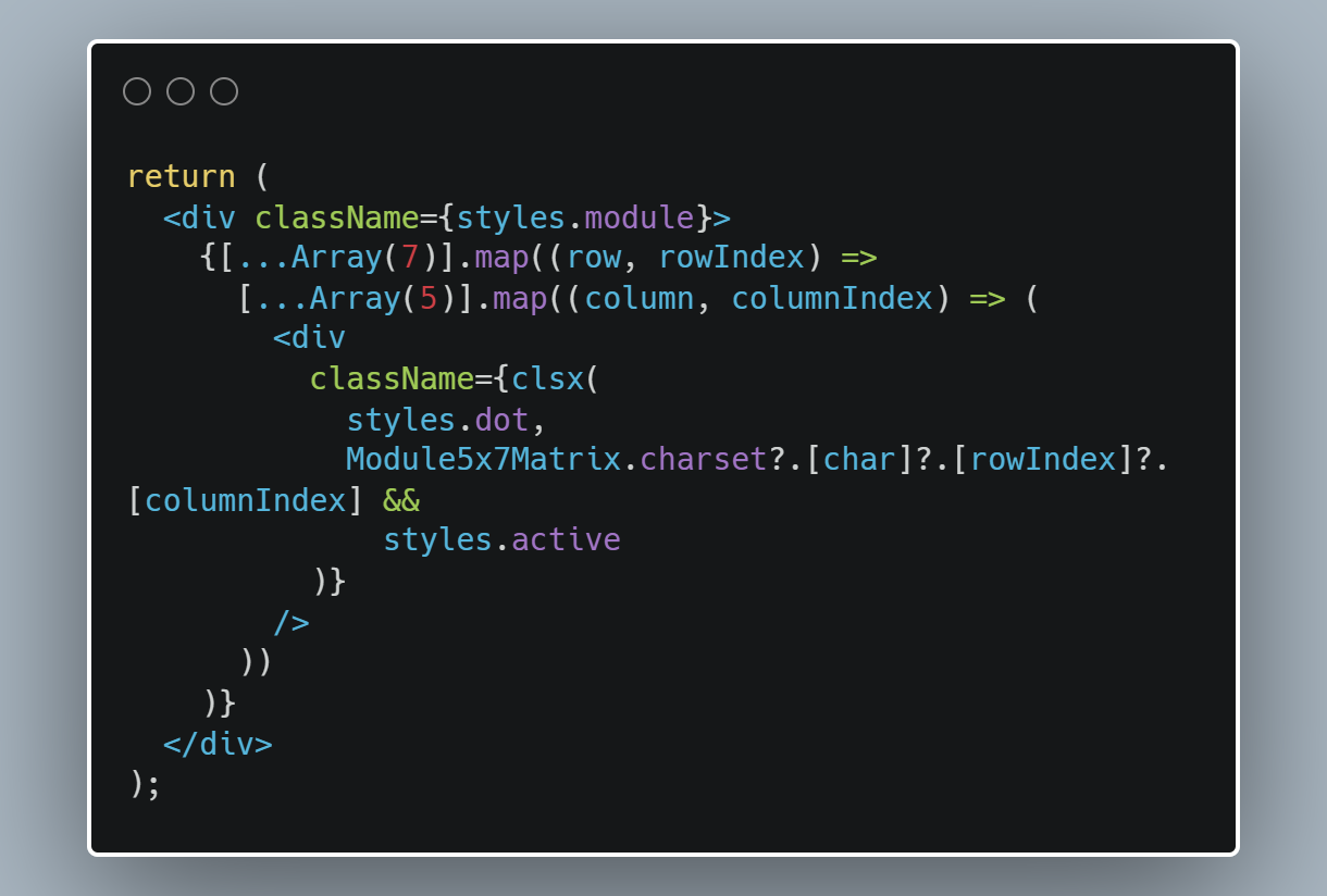
Our module will consist of 35 dots. We are going to generate divs and use the CSS grid for positioning. This is how the markup looks like:
Here you can see the full CSS code for this module.
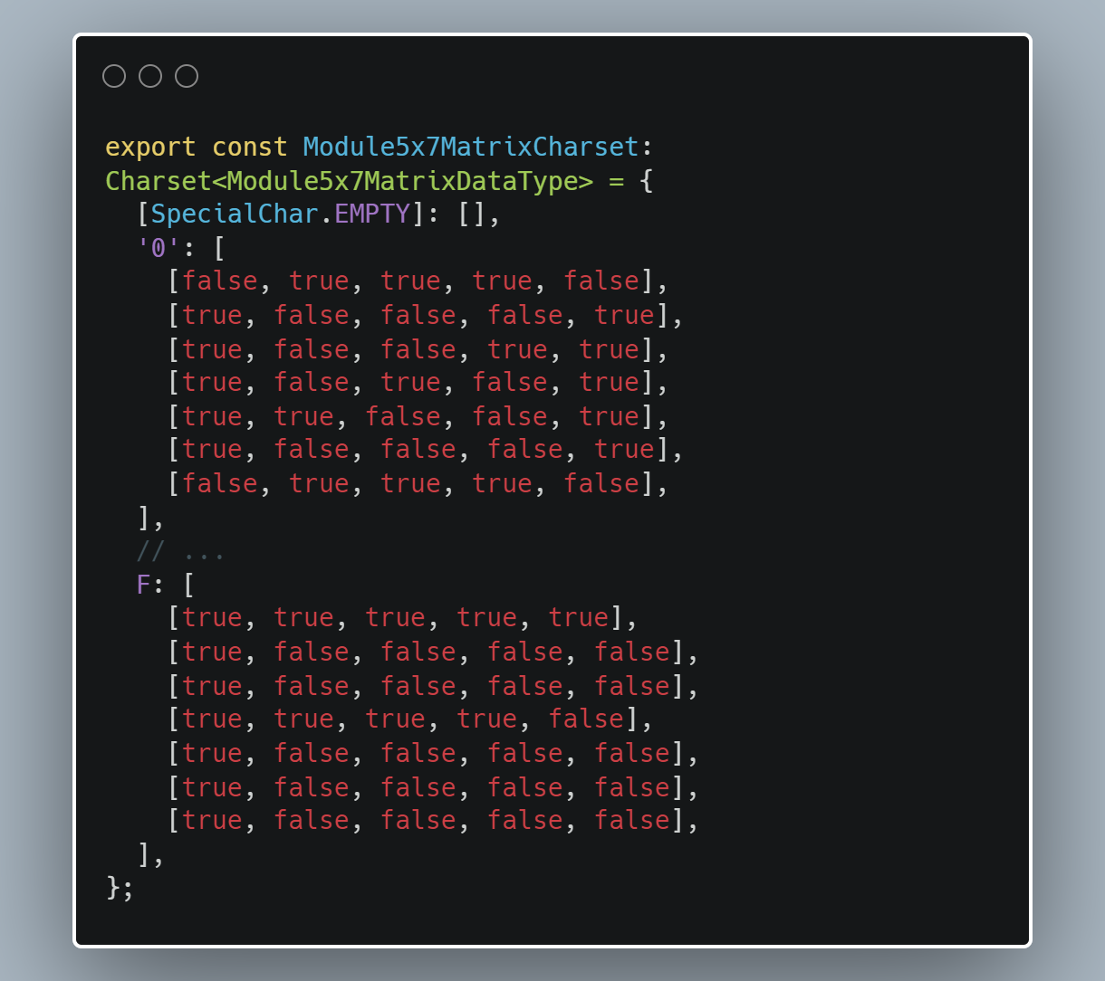
Next, we are going to define the module's charset. As I mentioned earlier, it'll be an array of booleans. For demonstration purposes, I have added the digits and letters A-F, so that we can display hexadecimal codes.
Finally, we assign the charset and dimensions to the module.
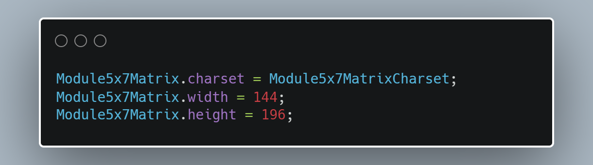
Let's take a look at the final result. This time the input reads as "9BB901", which is the hex code of the module's background colour:
 |
|---|
| Text displayed using 5x7 dot matrix module |
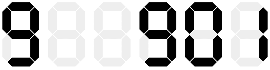
And here goes the same text with a 7-segments module for comparison: Note that this module does not support letters and instead displays empty fields.
 |
|---|
| Text display using 7-segments module |
Wrap up
That's it for today. We have created the main component and another display module. The full code is available here. Stay tuned because in the next part, we will add some customization options to our component.
See you next time!